Display font for bold headlines and graphic signage
Fabianestem, created under the Fabianestem alias, is a display typeface built for high-impact creative work. It converts short words into dense, graphic blocks suited to posters, headlines, and logos, using a bold, rounded, pressurized style. The design prioritizes visible weight and compact rhythm, appealing to graphic designers, digital artists, and hobbyists who need a confident, statement-making headline face for visual projects.
How the font reshapes headline presence
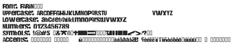
The font applies a bold, rounded sans-serif silhouette with a slightly distorted, inky appearance that emphasizes single-word and short-phrase layouts. Its pressurized look turns compact words into near-graphic elements, and the face is described as highly legible at large sizes for posters and logos. This makes it suited to display uses where letterforms serve as visual anchors rather than continuous reading text.
How much typographic control the font supplies
The font includes a set of 124 glyphs and a deliberately tight spacing rhythm, which produces a dense horizontal texture in headlines. Designers get consistent stroke weight and uniform counters, useful when typesetting short lines at large point sizes. The character set limits extended typographic needs, so verify language coverage and special characters before choosing it for multi-language or body-text roles.
Is installation and daily use straightforward
The font ships as a standard TrueType Font (.ttf) file and installs into the system font library. On Windows the documented workflow is to extract the FABIN___.TTF file, right-click it, and select Install, after which the face appears in application font menus. Because it is a font file rather than a runtime tool, there is no persistent background process to manage.
Who it fits and how mature the design is
The font targets designers and hobbyists seeking striking headline typography; the face dates to 2005 and has accumulated substantial distribution, which supports continued availability. It is listed for personal use by default, and its long circulation across design platforms explains why it appears in poster and logo work. For commercial deployment, confirm licensing terms and character coverage before committing to brand assets.
A focused, bold headline face for designers who need strong display typography
Fabianestem is a focused option for designers who want a heavy, graphic display face that reads well at large sizes. Its design works best for short, visual text rather than extended copy; check extended-character needs and licensing for commercial projects. Test the face in intended layouts and at final output sizes before using it in brand-critical materials.